The other side of growth
I’ve been thinking a lot about the design for this website as I build it in public - and why it feels almost impossible to get started. I then started reflecting on how I’ve shifted from primarily design to primarily development over my career. Incidently, I also needed some content so I could add a blog to the site, so this post was born.
My journey
Over the past nineteen years, my story arc takes me from being a designer who could code and ends up with me as a coder who occasionally designs. In my early days, I primarily designed websites in Photoshop, and then took the steps needed to turn them into running websites. I sprinkled in just enough of JavaScript to add some animations or other interactivity. In time I settled into a hybrid approach where I designed in Photoshop or Illustrator until the design tool was more work than simply coding the website. If I got stuck on a detail while coding, I’d take a screenshot of the design back into Photoshop to figure it out. I never was 100% on board with designing fully in the browser. It was too tempting to settle for what was easy instead of pushing for designs that might be difficult to replicate in CSS.
Fast-forward fourteen years and now I describe myself as software engineer and often don’t even mention myself as a designer. I’m still involved in design since I work on a design system team, but that is focused in SaaS web application design and my role is primarily development. Its quite different from building brochure websites for churches and businesses!
I’ve loved my professional journey, and I still deeply enjoy learning new things… its just that the new things I’m learning are technical and not general web design. It wasn’t until I started approaching the design of this website that I realized what I’ve lost. Not lost in the sense of gone forever, but skills I’ve not practiced have grown stagnant. It is strange–and even a little humbling–to be researching terms like “how to design a website” with the hope it will remind me of things I used to know.
Design styles have changed
I think one of the pieces that has been challenging is how much web design styles have changed during the years I’ve been focused on development. In one way the minimalistic styles make design a little easier… but nailing those looks, while still including quality and subtle details, feels daunting.
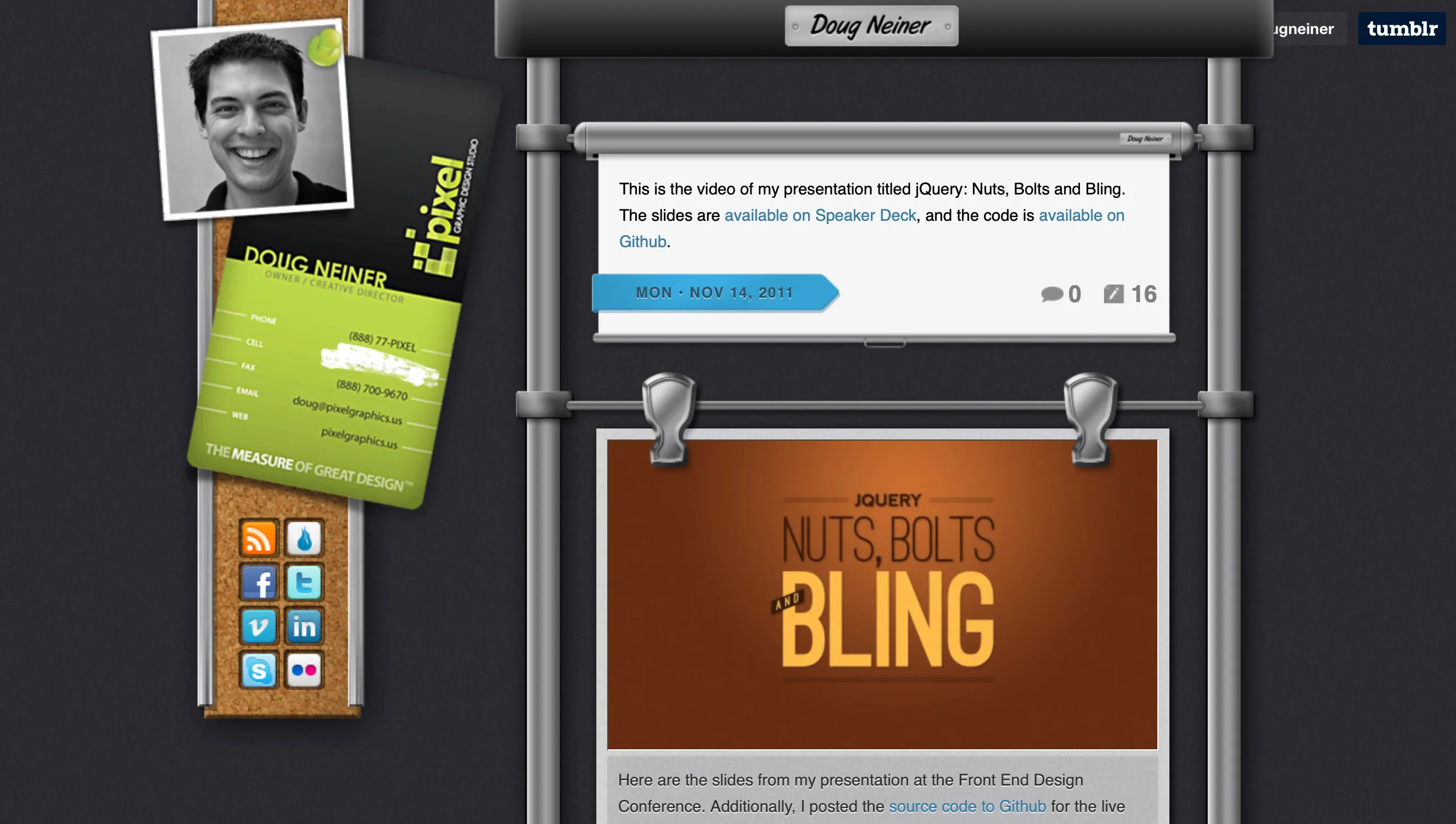
My old website (circa 2010) was a mashup of real world textures and concepts. I’ve always been drawn to skeuomorphic design and was a touch sad when Apple moved away from that in their mobile apps.

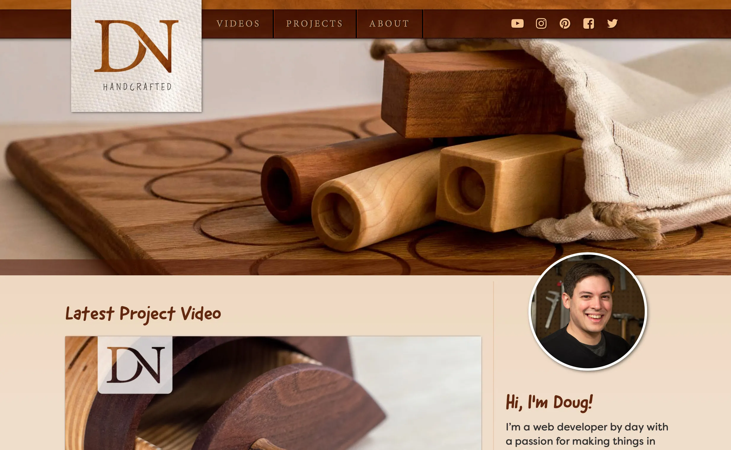
Almost 9 years later, my hobby woodworking website (circa 2019) felt easy at the time to throw together as I was able to leverage photography and wood tones to bring everything together. I’m still happy with this site design even though I haven’t produced a new YouTube woodworking video in years.

Tooling and approaches have changed
I’m a big fan of Figma, and plan to design this website using it. However, despite liking the product, designing in it still feels foreign to me. In some ways it feels more like coding than designing as I think through reusable components and variables. I probably just need to chill out and get some designs flowing before I think about structuring them!
Thinking mobile first has been a consideration for years… yet my brain still wants to think desktop first, then adapt for mobile. Given how much content is consumed on mobile devices, I really need to change my thinking on this.
I have changed
While I was actively growing in my knowledge of JavaScript and web application development, I didn’t realize how much of my design side I was letting go. Some of the techniques and approaches I used to have at the ready aren’t quite as ready as they once were! I can easily optimize a poorly performing React component or leverage an IntersectionObserver when needed, but designing my personal website? That’s another story.
Its clear I’m going to have to brush up on a lot as I undertake this website design and build, but I’m hopeful some of it will come back to me quickly. As I ramp back up on website design, I left to wonder… what previous knowledge will my new learnings displace!